Waxfinds: Share your record collection
People want to share music they love and connect with others about it on social media, but the “big platforms” in social media make it harder and harder to connect with like-minded people.
Like the “cut-out bin” in record stores of the past, music discussion has been cast aside in a small corner of the internet and devalued.
I asked a handful of vinyl record collector-types who share their collections on social media how they felt about it and what they wished they could get out of the experience.
My proposed solution is a social mobile app called Waxfinds that is specifically for sharing musical discoveries and purchases with other people and integrates with the incredible user-built database of Discogs.
My role was to conduct research with target users and then use their feedback to design and test the prototype.
Follow along below for a detailed look at the entire process.
SECONDARY RESEARCH
“Spin the black circle”
Before talking to people, I did a little secondary research about record collecting and social media habits to get the lay of the land. Record collecting is only growing in popularity. According to statista.com:
Vinyl album sales in the United States have grown for the 14th consecutive year.
Discogs.com is a primary resource for record collecting and its database will prove to be the backbone of the solution we come up with.
Discogs is a user-built database of music. More than 555,000 people have contributed some piece of knowledge, to build up a catalog of more than 13,360,049 recordings and 7,263,820 artists.
Additionally, I surveyed the competition to see how apps like Untappd and Instagram perform when it comes to sharing specific interests. Untappd has an incredibly rich data-driven check-in system for sharing and ranking beer, while instagram excels at visual storytelling.
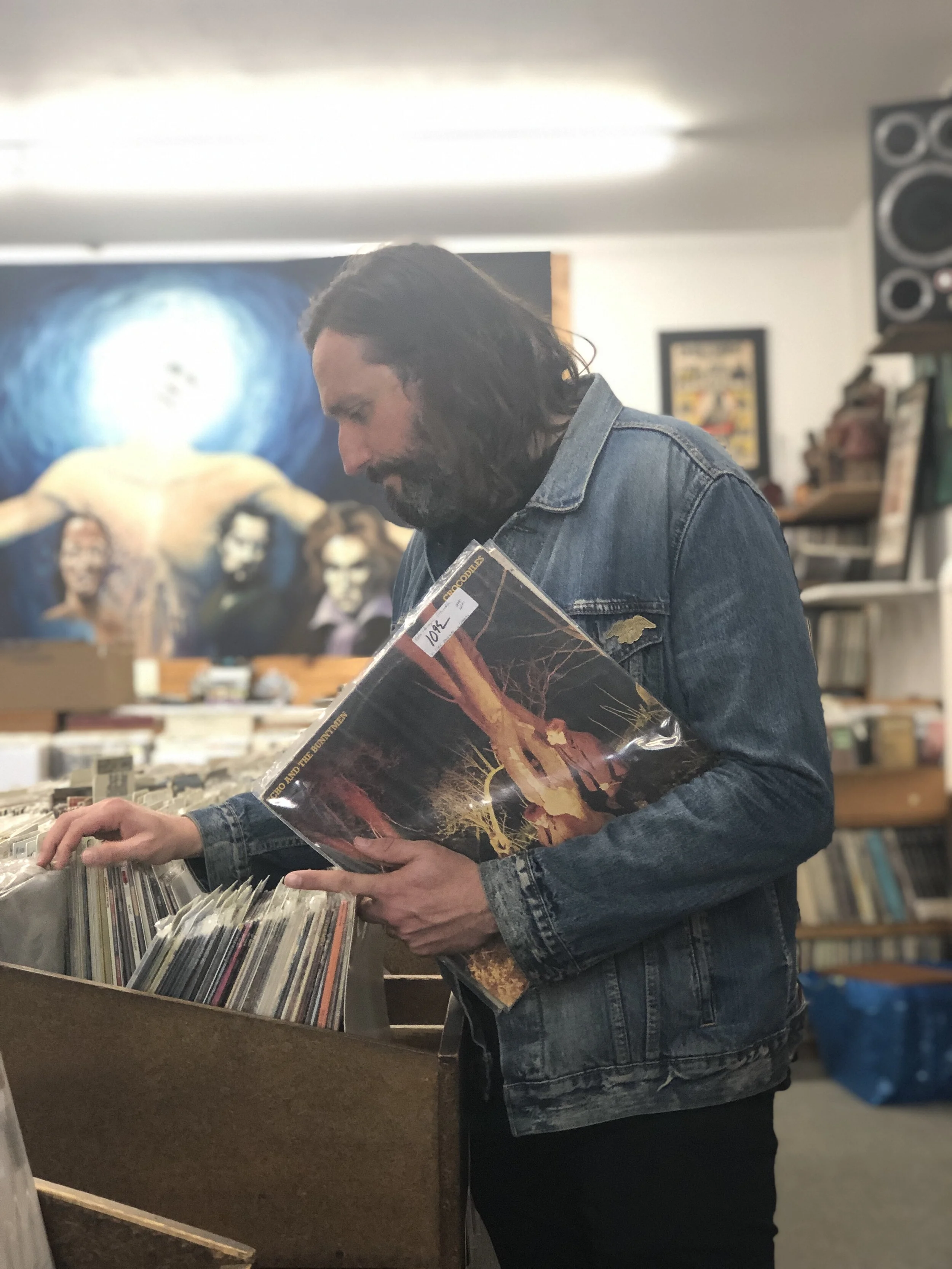
The designer, shopping for records, yet again…
PRIMARY RESEARCH
Take it to the people
While I had a pretty good idea of what I wanted to do, it’s always best to try and figure out what the problem is and what sorts of frustrations people have when sharing music with people online.
After screening potential candidates, I talked to 5 people I felt would best fit my target users.
People who:
Collect records
Share music they bought or enjoy with others online
Enjoy interacting with others about records
The general vibe I got from people was that they enjoyed discussing music (specifically records, but also CDs, and just “bands” as well) online, but find it increasingly difficult to do so, whether it be with the algorithm, the news cycle, or not wanting to annoy their non-music friends.
People Say:
The algorithm, man…”
“Music is how I find my tribe”
“I’m almost as interested in a story someone has about a record as I am about the music/record
SYNTHESIZING THE RESEARCH
Birds of a feather
I grouped people’s responses into an affinity map to get some basic categories from their insights. This made it easier to see how people felt about the basic categories we had to deal with, mainly:
Collecting
Records/the object
Interaction
Sharing
Social media platforms
SYNTHESIZING THE RESEARCH
Do you feel like we do?
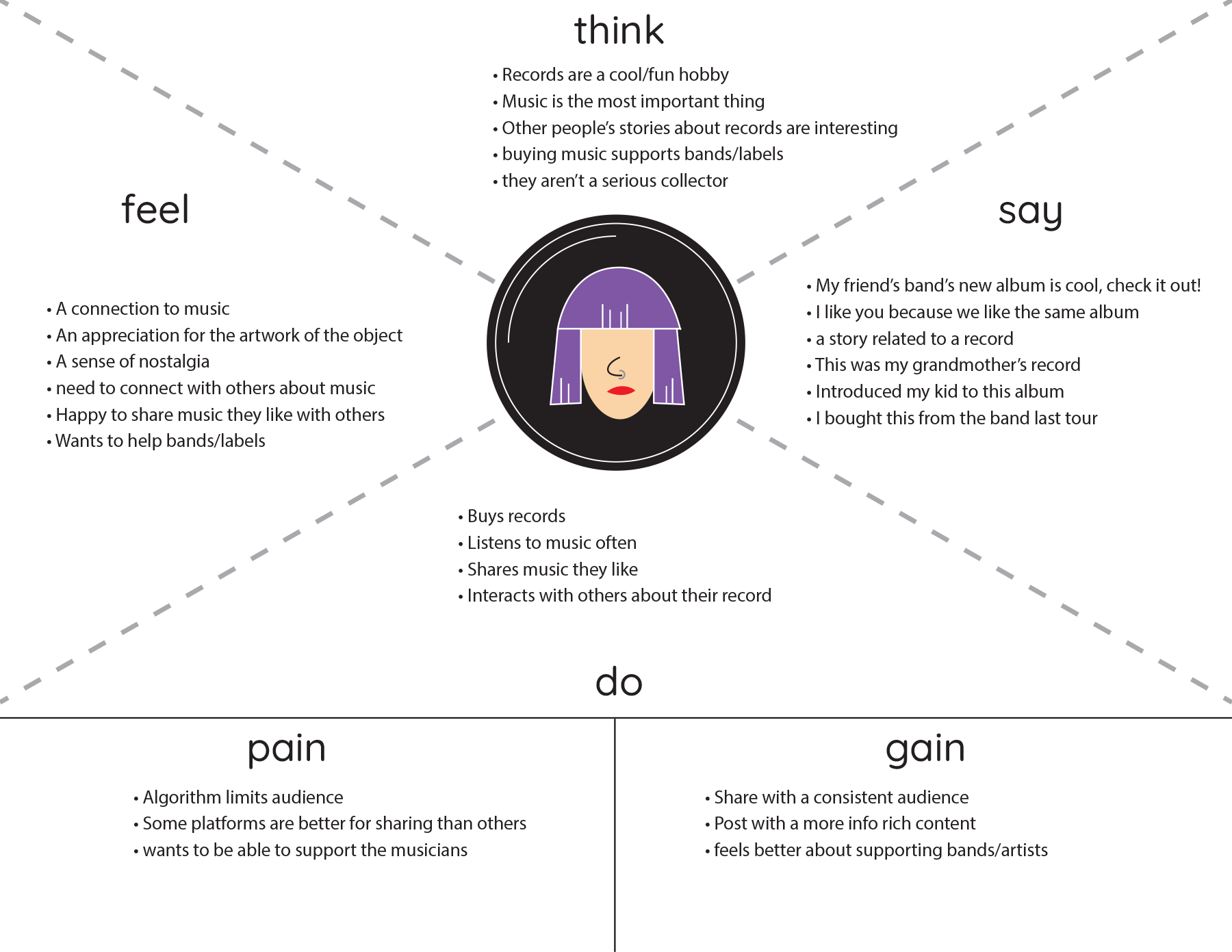
Within the basic categories, I was able to get a sense for people’s behaviors and feelings about sharing their music collection with other people. Time for an empathy map (or two!).
This is empathy map represents the “super collector” type.
It was pretty clear there were different kinds of potential users for this app when I was creating the empathy maps, which helped when I got to the next step... personas!
SYNTHESIZING THE RESEARCH
Every kind of people
There were clearly different kinds of users. Ranging from hardcore collectors who mostly chase “objects,” to people who are very passionate about music and have a large collection, to promotional fiends and newbies These personas helped define the problems I needed to solve.
The personas represent a few key users summed up simply as:
Hardcore Collectors
Passionate Music Fans
Promo Hounds
Newbies
IDEATION
An idea takes hold
By taking into account who might be using this solution and how, I settled on an idea. How about an app that combines pictures and stories with a robust database of information that leads users to share and learn? My original idea was to take the fundamentals photo/caption sharing and check-in apps, but make it work for records/music.
Original sketch.
(Not pretty, but it’s just about getting the idea out)
After some sketching, I settled on a picture-and-comment feed layout where each post has info about the album and a link to a deeper level detail, should the user want to know more. It’s not pretty, but hey, it’s an idea!
IDEATION
Go with the flow
After defining the basic tasks our users would need to accomplish, it was time to work out some user flows to help sketching and wireframing go more smoothly. We assumed a standard onboarding process so I could dig into some of the more advanced user flows. Some refining and simplification was necessary, but eventually I settled on some flows that made sense.
For this product to work, users would need to:
Create account (assumed)
Find and connect with one another
Share their music and stories with each other
Interact with other users’ posts
The “create post” user flow.
DESIGN
I brought my pencil…
“Gimme something to write on…”
I am by no means an artist, but I made it work. That’s the beauty of sketches. Using the user flows I created as a guide, I sketched each screen needed to complete the flow. A basic layout is taking shape!
DESIGN
Frame by frame
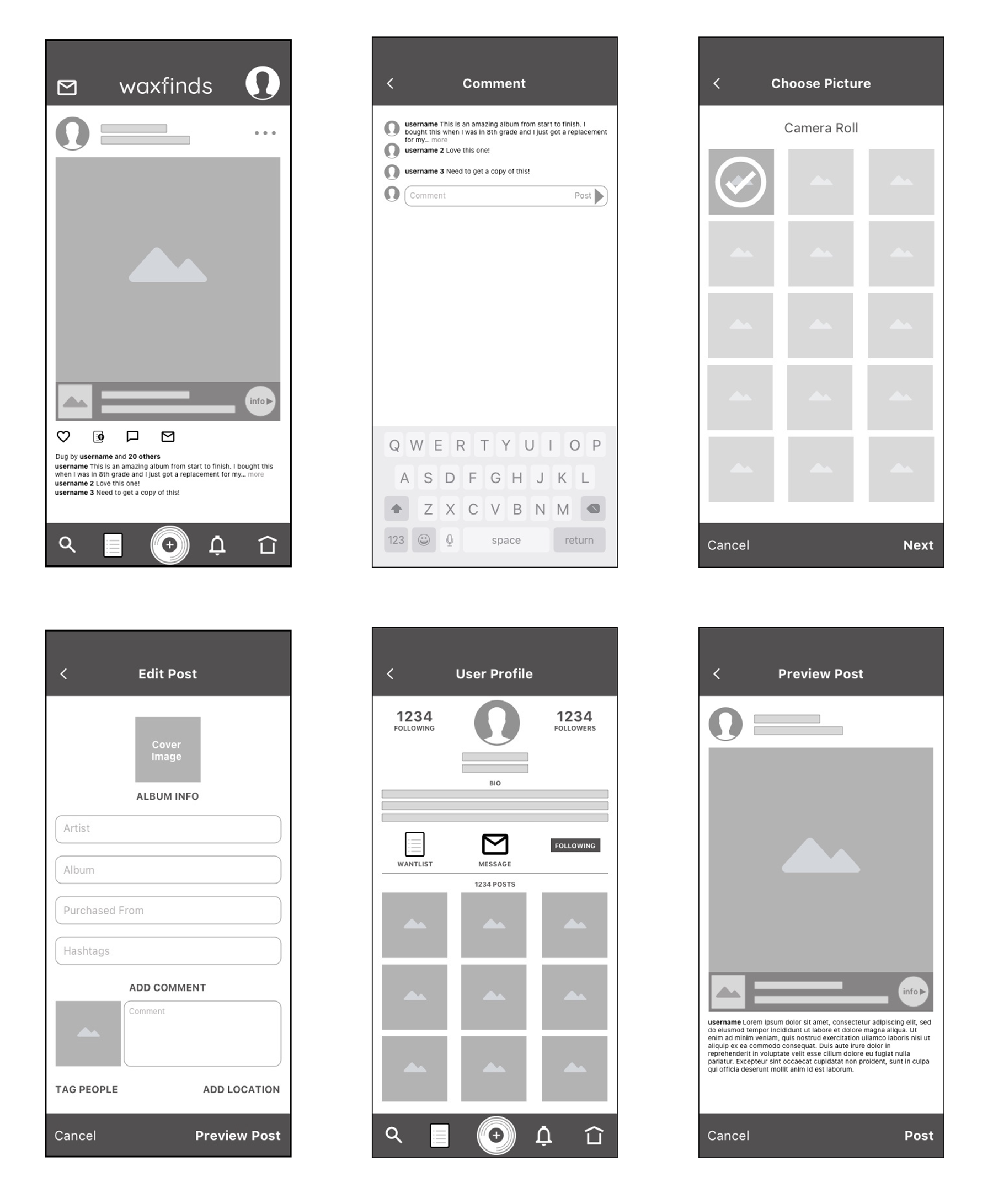
From my basic sketches, I was able to make quick work of wireframing my user flows in Sketch.
This helped to figure out basic layouts and spacing of all of the necessary content in the before refining them with hi-fi layouts.
Mood board and excerpts from the waxfinds styleguide.
DESIGN
It’s the new style
Before taking the wireframes into hi-fidelity land, I first had to establish a style.
Some main takeaways from my user research were that records have a sense of “Nostalgia” and “Cool” that I absolutely had to incorporate somehow with the limited visual space for personality in the app.
I decided to take some subtle cues from the Blue Note Jazz album covers from the late 50s and early 60s. Deciding on an orange gradient paired with some muted greys, which I felt really anchored a sense of “nostalgia” without looking too old fashioned. Note the tweaked logo from the one I was using earlier on the persona cards. I decided it needed to focus more on the record than the camera and has a more vintage type treatment now.
DESIGN
“The high-fidelity, first-class traveling set”
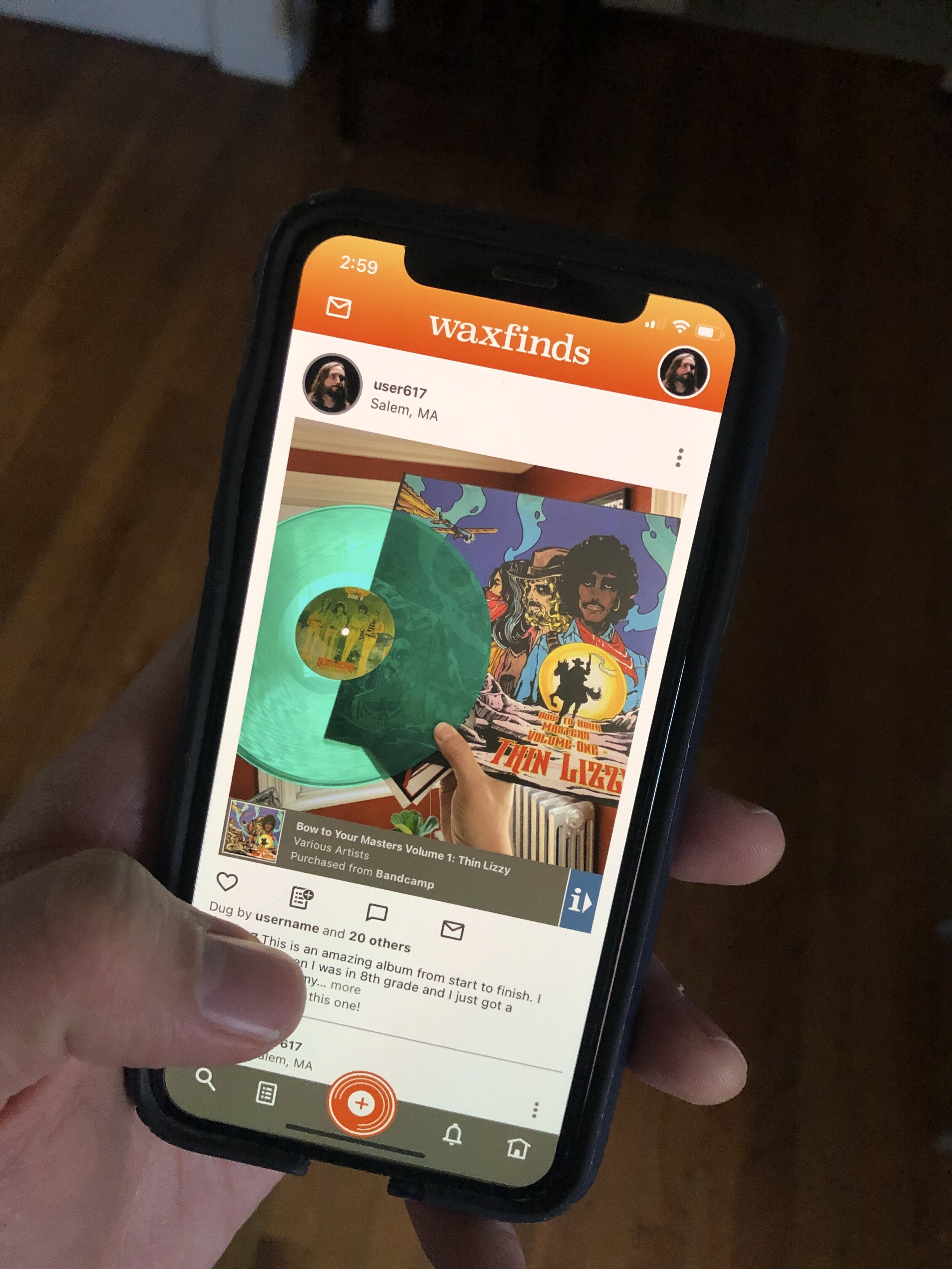
My first pass at a hi-fidelity version of the screens in my flow turned out well.
Each post has a little album info bar that can’t dig into the visual real estate too much. It may be a little small, but if the user wants to learn more about the album, they can click on the “i” button to find out more info. It made sense to me, but testing with users would really let me know if that was a good enough trade-off.
One of the biggest hurdles was the “Wantlist” icon. I didn’t want to have to label everything, so I decided to go with a simplified “list” looking icon and then rely on some feedback when clicked to reinforce the button’s purpose.
The “wantlist” and “add to list” icons. I tried to incorporate feedback when things were added to the list to reinforce the button’s function.
More hi-fi screens expanding the scope of the user flow a little.
DESIGN
Keep on pushing
In addition to the basic user flows I laid out earlier, it was clear from some early testing with people that I needed to implement some slightly more robust features in the prototype in order to demonstrate what is really unique about this to people.
Thus, I made mock album information pages, wantlists, and user profiles to show that with a little exploration, users could learn more about the music people are posting and more about what that person likes.
It may be slightly overbuilt for usability purposes, but I felt it was necessary to really get the point across to users, so they didn’t think it was “instagram with an extra box.”
While I wish I could show the true power of integration with the Discogs database, I could only hint at it and explain it a little bit when testing.
PROTOTYPING & TESTING
Use me
After creating all of the necessary screens, I assembled them all together to create a working prototype in inVision.
The next step was to test it with some users!
Overall, the feedback was good, and people really loved the idea and were surprised it didn’t exist already. That’s all well and good, but was it USABLE?
Mostly! But the big sticking point is the “wantlist” feature and how to make that obvious. By refining the icon a little bit and providing a little feedback when clicked, people were able to figure it out. It was obvious from the album info page, but less obvious from the main feed.
There were also some missed opportunities to add some “empty state messaging” on the search page and the message page.
More hi-fi screens expanding the scope of the user flow a little.
PROTOTYPING & TESTING
Test for echo
Using the feedback from round one of usability testing, I was able to refine some elements (the home button looks more homey now).
Some added empty state messaging cleared up some hangups that people faced when they came across a mostly empty screen.
SUMMARY
And in the end…
Overall, even without being able to actually demonstrate how powerful integration with Discogs.com would be, people generally got this idea and were on board with it. So I consider it a success, overall.
Testing an idea on people always brings on an onslaught of suggestions. There were some slight modifications I could make by adding a little more feedback when users accomplish a task, for instance, an “Added to Wantlist!” pop-up would be good when a user clicks the “add to wantlist button.
While people talked during testing, it was clear that there were many directions I could take this app. One thing I missed was a major potential user/persona: Music Merchants, ie: Record Store owners and Record Labels.
While I didn’t envision it as a marketplace, it makes total sense that people would use it to try and sell their wares. It would most likely add another user flow or two that I didn’t hit upon in my sketches and iterations. Next time!


